Intro
I chose newegg.com for my usability project as it was historically targetted at very technical users, but they have introduced new products and positioned their messaging to be more accessible to mainstream users. I want to evaluate if their website is intuitive for the personas I've identified and what changes, if any, are needed to make it better.
Heuristic Evaluation
| Usability Problem | Location | Heuristic(s) Violated | Severity Level |
|---|---|---|---|
Shows “Hello” and “Welcome” and I’m unsure which path they want me
to take as the initial action. 
|
Banner across the whole site | Consistency and standards – Hello and Welcome are both intro words indicating a starting point. They need to be clear which action they want the user to take. | 2 |
The Hero banner in the middle of the screen for Black Friday isn’t
responsive like the rest of the site and is cut off
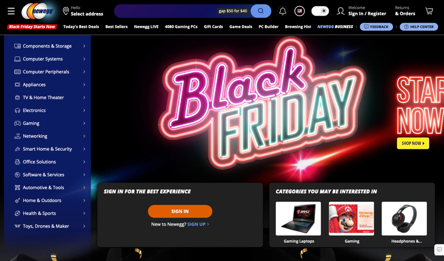
|
Home screen | Flexibility and efficiency of use – The site should adjust to the user’s browser’s dimensions so that they can see all of the content | 3 |
 |
Home page | Aesthetic and minimalist design – There are a lot of call outs competing for user’s attention and it is easy to be distracted. You can’t see in the screen shot, but the Black Friday banner also has animations in the background | 2 |
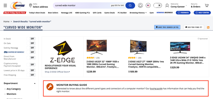
|
Search page for monitors | Consistency and standards & User control and freedom – Clicking on the buying guide link takes you to a different site that is missing the top navigation and doesn’t allow the user to return without using a back button | 3 |
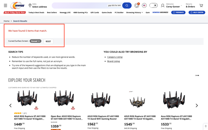
Clicking on the curved monitor category shows 0 results 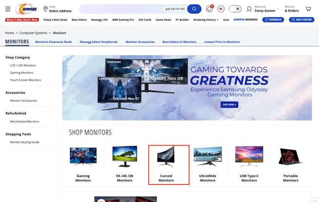
|
Error prevention – This is an official sub category on the Monitor’s category page and should either have default content or provide additional segmentation for the user to drill down into | 4 | |
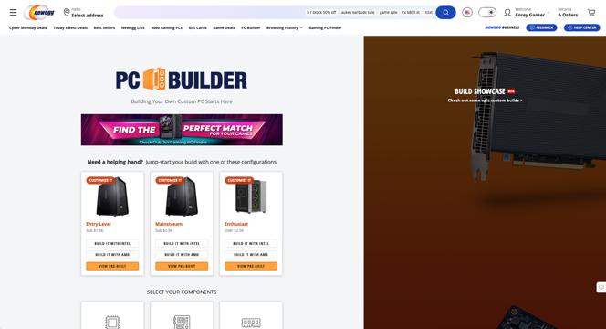
Clicking on PC Builder takes you to the page to build a PC with the
CPU automatically expanded, but if you click on the Newegg PC
Builder in the breadcrumbs, it takes you to a different landing page
that offers a better overview instead of dropping you right into the
configuration. 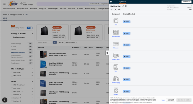
|
Header and also on the PC Builder page | Consistency and standards – the main navigation should take you to the same page as the main product category page in the breadcrumbs | 2 |
Personas

- Name: Sally Livewell
- Demographic: 62+ caucasian retired female
- Job title or main focus of activity: Retired and optimizing for quality of life.
- Goals: Enjoy retirement and make good financial decisions to maximize her retirement savings.
- Environment: At home in the suburbs in a home office with just spouse around.
- Technical or product domain expertise: Comfortable with finding answers online, shopping online and has a smart phone. Used technology at work everyday before retirement.
- A quote that sums up what matters most to the persona: “Retirement is a time to enjoy the things you never could before.” - From https://www.aag.com/articles/retirement-quotes/

- Name: Tanner Sampson
- Demographic: 32 - 38
- Job title or main focus of activity: Customer Relations Manager
- Goals: Family man, career growth focus, and carving out time to spend on creative endeavors.
- Environment: At home in the city in a home office with spouse and young kids around. Noise level can vary throughout the day, but Tanner has noise cancelling headphones to help him focus.
- Technical or product domain expertise: Grew up around technology and uses it for work and for fun.
- A quote that sums up what matters most to the persona: “The love you take is equal to love you make” - The Beatles
Test Plan
Scenarios
Scenario 1
Sally loves learning online, researching things she is going to buy and video conferencing with her friends. Recently while using her computer to do research, a window popped up and told her that the operating system she is using will no longer be supported and will no longer get security updates. Also while video conferencing, the software she uses to video conference said that her computer doesn’t have enough resources to provide the best experience for the video chat.
Sally would like to have better quality video and make sure that her computer is running an updated version of the operating system so it is secure. She also heard that the newest operating system has a new web browser included that has some fun features like tabs that would help her online researching. She hasn’t bought a computer in a long time and would like to understand the available options. She is cost conscious but wants to make sure the computer she buys will last her a long time.
Scenario 1 tasks
- Find the difference between a desktop, gaming, business and all in one computer.
- Find the cheapest dell desktop computer that includes the computer, keyboard and mouse. It doesn’t need to include the monitor.
- Compare the dell desktop that you found with any other desktop computer.
- Find information about the different types of monitors that are available.
Scenario 2
Tanner likes to try out new technology as it helps him grow in his job and helps him with his creative endeavors which include art and music. Recently Tanner was working on a song in his music composition software and his computer started moving really slow when he added his 50th track to the composition. He recognized that he needs more resources on the computer so that it can handle the artistic vision that he has for his music. Besides benefiting his music, he’ll be able to learn more about the new technology which will help him at his job. He is somewhat cost conscious but cares more about the features of the technology that he buys to make sure it accomplishes his goals.
He has limited space at his desk so he wants to make sure that the technology that he purchases will fit in the space that he has available on the desk. He had heard from a friend that a curved monitor will allow him to have more screen real estate and provide a new experience when he is working. He currently has 2 monitors and he thinks he would replace them with 1 curved monitor which will save space on his desk. He wants to find a website that he can go to that will make it easy to find the new technology and compare prices between technology options.
Scenario 2 tasks
- Find the cheapest curved monitor that has a rating of 4 or higher.
- Compare the curved monitor you found with another curved monitor.
- Build a PC from scratch so that you have all of the required components including keyboard, mouse, and monitor
Pretest questions
- Do you shop online?
- How frequently do you shop online?
- Where do you typically buy technology? (ex: computers, phones, tvs)
- When buying technology, what is the most important information that a site can provide to you to help with your purchase?
- How do you compare features/prices of technology products that you buy?
- Where do you learn about new technology?
Moderator Script
Hi ______________________ My name is Corey and before we dive in, how are you doing today?
Fist of all, I want to thank you for participating in this study. I am conducting a usability test of a website for an online technology company called Newegg. For the next 40 min, we are going to spend time together to get your impressions of this website.
I am going to ask you to complete a series of tasks that match goals typical users like yourself might have when using this website. I am interested in knowing how you do things, where you look for information, and other behaviors when using a website. I am also very interested in knowing what you're thinking, along with how you react to things on the website.
While you are testing I need you to "think out loud." Usually a person will have an internal monologue that helps them think through the task at hand. Common statements that you may be thinking include "Why is this so hard?" "What am I looking for?" "I think this is what I need to do." I want you to do the same thing, but instead of just thinking it, I want you to say it out loud.
I know that sounds a little strange, but this really helps me understand what is going through your mind while you are using the website. If you like something, I want to know that. If you get frustrated or are confused, I want to know that, too. There are no wrong answers in this study. We're looking for your genuine impressions. I want to stress that the focus of this activity is to test the website and not you.
While you are completing the tasks, I am going to watch you and take notes so that we can report our findings to our sponsors. They will use our findings to improve their website in the future.
Before we proceed with testing, I need to run through some information. The first one is a confirmation that it is ok to record this session and that I can use it for analysis along with sharing it with appropriate parties for grading. Please say “I accept” to note that I can proceed with recording and using it for analysis.
This second is a pretest questionnaire. I want to have a better understanding of your background as it relates to the tasks you will be performing. This helps me have a better understanding of your interactions with the website. I'll read the questions aloud to you, and you just answer honestly. Since we are recording audio, you can just say your answers out loud. (Read the pretest questionnaire to the user and record answers.)
Pretest questions
- Do you shop online?
- How frequently do you shop online?
- Where do you typically buy technology? (ex: computers, phones, tvs)
- When buying technology, what is the most important information that a site can provide to you to help with your purchase?
- How do you compare features/prices of technology products that you buy?
- Where do you learn about new technology?
I want you to take a moment to describe the setup you will be using. Can you confirm the computer and browser you'll be using?
I am going to give you a number of tasks to complete. Each task will have a specific goal, and I want you to explore the website and complete each task. While you're using the website, I will be taking notes, and want to remind you that we are testing the website and not you so all of my notes will be related to the website. I will read off each of the tasks and then you will go through and complete the task. I want you to think out loud as you approach each task. Say out loud the steps you are taking along with any confusing or easy to understand aspects of the site. After each one, we will talk about your experience with it, how you felt during the task, and so on.
So, before we get started, do you have any questions or concerns?
OK, then we can begin. Here is task #1. When you're ready, I'll read the task out loud and let me know if you have any questions.
- Look at the website and describe your first impressions of it.
- Sign up for the website’s newsletter. You can use joe@example.com as the email.
- Find the difference between a desktop, gaming, business and all in one computer.
- Find the cheapest dell desktop computer that includes the computer, keyboard and mouse. It doesn’t need to include the monitor.
- Compare the dell desktop that you found with any other desktop computer.
- Build a PC from scratch so that you have all of the required components including keyboard, mouse, and monitor
- Find information about the different types of monitors that are available.
- Find the cheapest curved monitor that has a rating of 4 or higher.
- Compare the curved monitor you found with another curved monitor.
User Videos
User 1 - TG
User 2 - GH
User 3 - BH
Findings
User 1 - TG
Teresa's first impression was that the site was busy (https://youtu.be/8Zj4IOm3oJA?t=458). She said that if she didn't have to get something specific from this site, then she would leave and go somewhere else. The busyness of the site distracts from the tasks that she is trying to accomplish and makes it harder for her to scan for information. In the example of trying to find the newsletter sign up, when she navigated to the next page and the site had a pop up at the bottom, she ignored it until attention was called to it (https://youtu.be/8Zj4IOm3oJA?t=648).
When performing the task to find the difference between PC types (desktop, gaming, business, and all in one) she mentioned that she doesn't want to read a lot, but that she would if she was really serious about the task ( https://youtu.be/8Zj4IOm3oJA?t=864). This highlights that the site isn't providing the information in an easy to consume format so that the user can quickly scan/understand differences. When she was asked to find the different type of monitors, she leveraged the navigation and was able to find the information along with making it easy to drill down into curved monitor category (https://youtu.be/8Zj4IOm3oJA?t=1660. This highlights that the categorization for Monitors was easy to find and despite the busyness of the site, she was able to accomplish the task.
User 2 - GH
Gracie's first impression was that the site was busy (https://youtu.be/543pUxYWUMM?t=383). This caused her to feel overwhelmed as there is a lot of information to go through. She performed the next task of signing up for the newsletter which she was able to find through search, but when signing up for it, she didn't receive a confirmation (https://youtu.be/543pUxYWUMM?t=512). Search was a fall back to finding the information as she said that there are too many menus to go through and she couldn't find the information she was looking for. When looking for information on comparing the type of desktop computers, she highlighted that she expected that information to be at the top of the page instead of at the bottom of the page (https://youtu.be/543pUxYWUMM?t=745).
When finding the cheapest Dell desktop, Gracie highlighted that the amount of filters were overwheling (https://youtu.be/543pUxYWUMM?t=1010). This highlights a common theme throughout the website that they are trying to present too much information to the user and not in an easy to consume way. She primarily used search to accomplish this task and this also led to her not being confident that the results were all inclusive (https://youtu.be/543pUxYWUMM?t=1044). When comparing the desktop she found it was easy to get to the comparison page, but weird that it added a recommended model even though she didn't select it for comparison (https://youtu.be/543pUxYWUMM?t=1117). When building a PC from scratch, trying to add the keyboard and mouse to the build was blocked by a message at the bottom of the slide out that couldn't be dismissed (https://youtu.be/543pUxYWUMM?t=1389). She had good feedback on being able to exclude specific components on the PC Building if you already had those parts (https://youtu.be/543pUxYWUMM?t=1505).
When looking at different computer monitors she highlighted that there is a lot of information on the buying guide and that there should be a more summarized view (https://youtu.be/543pUxYWUMM?t=1656). When comparing a monitor, it showed the same monitor twice but didn't denote that they were different or that one was a sponsored result (https://youtu.be/543pUxYWUMM?t=1917).
User 3 - BH
Brendan's first impression of the website is that it is overwheling and not sure of where he should start (https://youtu.be/07gF8mZkwjU?t=442). When trying to sign up for the newsletter, it was complicated and he wasn't sure if he should create an account or where to find the sign up (https://youtu.be/07gF8mZkwjU?t=583). When understanding the difference between computers, he said it wasn't presented in the way he'd expect and that he would typically search google and then watch videos about the comparison so that he had a more comprehensive overview (https://youtu.be/07gF8mZkwjU?t=906).
When finding a Dell desktop with keyboard and mouse, he had a hard time determining if the keyboard and mouse was included in the package or if it just showed in the picture (https://youtu.be/07gF8mZkwjU?t=1065). He expected to see this information to show in the specs but it only showed it in the name of the product. When trying to find the categories like Dell, it wasn't intuitive that the brands that they show were links into the filtered categories for that brand (https://youtu.be/07gF8mZkwjU?t=1139). When comparing the desktop he found to another one, he found it confusing that they showed recommended ones and he was unsure about which one he selected to compare (https://youtu.be/07gF8mZkwjU?t=1217). When comparing, it didn't bring over the one he was looking at initially so it caused confusion (https://youtu.be/07gF8mZkwjU?t=1311). When trying to build a PC, the PC builder option at the top of the screen was cut off and he had to scroll over to see it (https://youtu.be/07gF8mZkwjU?t=1736). When looking for monitors, he expected to see navigation on the left side but there was inconsistencies on the navigation as he drilled in like alloing a high level category drill in, but not sub category drill in on the left side (https://youtu.be/07gF8mZkwjU?t=2213).
Recommendations
- The homepage was overwhelming to all of the participants. A re-design of the homepage with emphasis on reducing animations and promos with more emphasis on the main navigation elements will encourage visitors to discover what they are looking for.
- The number and segmentation of filters are complex. The left side of the screen has a lot of filters and requires the user to scroll for a while to see them all. It would be good to consolidate the filters or present it in a way that is easier to filter at the top of the screen. Maybe through selectable filters next to the sorting option or even have smart search apply filters.
- Provide information about differences between sub categories on the main category page. There are a lot of categories and within those categories, a lot of sub categories. It would be good to make sure the differentiations of the sub categories are shown at the top of the main category page so that users can compare and make an informed navigation choice.
- Confirm when an action is performed like newsletter sign up. When Gracie signed up for the newsletter it didn't provide a confirmation that the action she took succeeded. They need to show a success message so that user knows the action was successful
- Make sure the website is responsive and that the menus are accessible regardless of screen size. The hero image and the top navigation are cut off when resolution/browser size is reduced. Need to make sure all visitors have a similar experience and that key navigation elements aren't hidden.
- Make sure elements in the interface can be hidden/dismissed if they block other actions. In the case of building the PC, the very bottom of the component screen there was a message that blocked the accessories add button. There ideally needs to be padding between the bottom message and the action button so it doesn't obfuscate it. At the very minimum, it should be dismissable so the visitor is able to access to button behind it.
Self Reflection
This usability project highlighted the importance of getting feedback on your site/product. It is easy to have blinders on to what you are creating and not see the flaws/inconsistencies. This is even true to the usability script I created. While going through the script with the participants, their questions/clarifications highlighted how I could have improved my questions to be clearer so there was less ambiguity in the task.
While moderating, I tried to be careful about what I said to ensure I wasn't confirming/denying their feedback so that I didn't introduce bias. It is a fine line to provide guidance and making sure you don't influence the results. My heuristic evalution hit on some of the points that the users encountered, but it was interesting to see that they got to that conclusion a different way.
Overall I enjoyed the project but also can see the amount of effort it takes to conduct a usability study. The good thing is that a lot of the effort is a one time cost and then you can repeat as many times as needed. I plan to leverage usability tests at my work to help in the development of the sotware I manage.